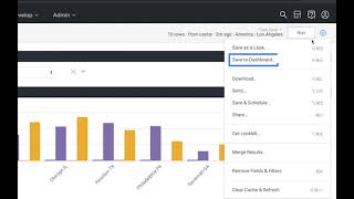
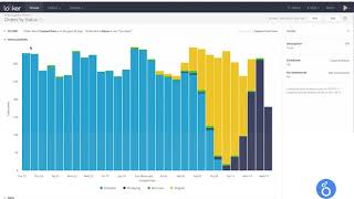
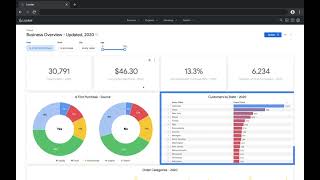
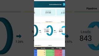
Dashboards (Looker, etc.)
Most marketing dashboards are graveyards. Forty tiles, three filters, and nobody opens them after week two. This lesson teaches you how to build a dashboard that an exec actually checks on Monday morning, and that a campaign manager actually uses to kill a bad ad on Tuesday afternoon.
Quick Summary
- A good marketing dashboard answers 5-7 recurring questions with live data, nothing more.
- 72% of marketers export dashboard data to Excel when the dashboard fails them. Your goal is to make that unnecessary.
- Build two separate dashboards: one for executives (revenue, ROI, pacing) and one for operators (channel details, creatives, conversion rates).
- Every chart must map to a pre-written decision. If you cannot complete "if this number does X, we will do Y," cut the chart.
- Trust beats sophistication. Stale data and undefined metrics kill dashboards faster than bad design.
What a Marketing Dashboard Actually Is
A marketing dashboard is a single page (or a small set of linked pages) that answers a small set of recurring questions, in priority order, using live data.
Think of it like a car's instrument cluster. Your speedometer, fuel gauge, and engine warning light are always visible. Your full service history is in the glove box. The dashboard shows what you need to drive, not everything the car knows.
In tools like Looker Studio (formerly Google Data Studio), Tableau, or Power BI, you connect data sources (like Google Analytics 4, Meta Ads, your CRM) and build visual summaries on top. The tool does the math. You make the decisions.
Looker Studio is 100% free from Google. It connects to GA4, Google Ads, Search Console, and hundreds of other sources via free connectors. It is the best starting point for any marketer learning dashboards.
Why This Skill Matters (With Real Numbers)
The marketing analytics market hit $7.12 billion in 2025 and is forecast to reach $14.55 billion by 2031, growing at 12.65% per year. AI-driven analytics adoption jumped from 31% of organizations in 2024 to 56% in 2025, and is projected to hit 78% by 2028.
But here is the trust gap: 87% of marketers say data-driven decisions are critical. Only 32% actually trust their data. The result? Most dashboards become "definition fights" in meetings instead of decision tools.
Key stats that explain the opportunity:
- Companies using effective dashboards make decisions 5x faster than competitors
- Effective dashboards cut reporting time by 80%
- 72% of users regularly export data to Excel when their dashboard fails to answer their question
- 40% of users rate their dashboards 3 out of 5 or lower
- Most marketing dashboards fail within 90 days: not because of bad data, but because nobody opens them
ASUS unified marketing data across all global regions using a centralized dashboard setup and now saves 90 hours per week on manual reporting, work that used to take days now takes minutes. Admiral Media moved from weekly reporting cycles to real-time reporting and saves 35-40 hours per week via automation.
The Two Types of Dashboards You Need
Most marketing teams make one mistake: they try to serve every audience with one dashboard. It does not work.
Dashboard 1: The Executive Scorecard
A marketing agency's weekly leadership sync, where the team used to walk in with raw exports and spend the meeting arguing about what the numbers meant Manual Google Sheets updates and ad-hoc digging meant the team spent over an hour combing through data before every client and leadership meeting just to agree on what happened that week Replaced the manual spreadsheet refresh cycle with a single always-on Databox dashboard the team could glance at right before a sync, instead of rebuilding the numbers from scratch
Result: Cut meeting prep from over an hour of manual data-combing to an immediate 'temperature check,' and moved reporting cadence from updating every three days to a lighter weekly rhythm (within weeks of switching from spreadsheets to a live dashboard).
SourceAudience: CMO, VP Marketing, CEO Refresh: Daily Rule: One screen, no scrolling, no filters needed
What goes on it:
- Blended customer acquisition cost (CAC = total marketing spend divided by new customers)
- Return on ad spend (ROAS = revenue from ads divided by ad spend)
- Pipeline created this month vs. target
- Budget spent vs. budget allocated
- One trendline showing week-over-week momentum
Dashboard 2: The Operator Deep Dive
Audience: Campaign managers, media buyers, growth analysts Refresh: Hourly for paid channels, daily for organic Rule: Filterable by channel, date range, audience segment, and creative
What goes on it:
- CAC and ROAS broken down by channel (Google, Meta, LinkedIn, etc.)
- Conversion rate at each funnel stage
- Top 10 and bottom 10 performing ad creatives
- Spend pacing by campaign
- Cost per lead (CPL) vs. target
The Step-by-Step Playbook
Step 1: Write the Decision First
Before you open Looker Studio, write this sentence for every chart you plan to build:
"If [metric] goes [above/below] [threshold], we will [specific action]."
Example: "If CAC from Meta exceeds $95, we will pause broad audience campaigns and shift budget to retargeting."
If you cannot finish the sentence, the chart does not belong on the dashboard. This rule alone eliminates 60% of the clutter in most dashboards.
Step 2: Pick Your 5-7 Core Metrics
For most marketing teams, these are the canonical metrics:
| Metric | What It Answers |
|---|---|
| Blended CAC | Are we acquiring customers efficiently? |
| ROAS by channel | Which channels earn their budget? |
| Conversion rate by channel | Where is the funnel leaking? |
| MQL to SQL rate | Is marketing handing off quality leads? |
| Pipeline created | How much revenue did marketing source? |
| Spend pacing | Are we on track to hit budget? |
MQL = Marketing Qualified Lead (a lead that meets your scoring criteria). SQL = Sales Qualified Lead (a lead that sales has accepted).
Step 3: Connect Your Data Sources
FIFCO's in-house marketing agency, unifying campaign and spend data across 50+ brands and multiple countries into one reporting layer Before automating the data layer, analysts spent weeks each month manually pulling exports from dozens of separate country- and brand-level ad accounts just to assemble one report Connected every regional ad platform into Looker Studio via Supermetrics so campaign data across all brands flowed into a single automatically refreshed dashboard instead of manual CSV pulls
Result: Saved over 160 hours of data-ingestion work a month and eliminated roughly $70,000 a year in compensation and tax costs tied to manual reporting (ongoing, reported in a 2024-2025 customer case study).
SourceIn Looker Studio, click "Add data" and connect:
- Google Analytics 4 (for website traffic and conversions)
- Google Ads (for paid search performance)
- Meta Ads via a free connector like Supermetrics or Porter Metrics
- Your CRM (HubSpot, Salesforce) for pipeline and revenue data
The biggest dashboard mistake is treating all your numbers as equally fresh. Google Ads data updates hourly. CRM pipeline data might only sync nightly. Always show a "last updated" timestamp next to every major metric. Stale data displayed without a warning destroys credibility. 67% of marketers lose confidence in analytics when dashboards show stale data.
Step 4: Design for 5 Seconds
Research shows dashboards must communicate their main message in under 5 seconds or users start ignoring them. Use this layout hierarchy:
- Top row: 3-4 scorecards (large numbers) showing your headline KPIs
- Second row: Trend lines showing those numbers over time
- Third row: Breakdown charts (by channel, by audience, by campaign)
- Bottom: Tables for sorting and drilling down
Limit your color palette to 2-3 colors. Use green for "on track," red for "off track," and one accent color for highlighted numbers. Test with 8% of your users in mind, that is the share of people with some form of color blindness.
Step 5: Add Context to Every Number
A number without context is meaningless. Instead of showing "CAC: $67," show:
CAC: $67 | Up 12% vs. last month | 85% to target ($79)
That single line tells three stories: the absolute value, the trend, and the performance vs. goal. Add a tooltip explaining how the metric is calculated (for example, "CAC = Total marketing spend / New customers acquired, last 30 days").
HubSpot's internal marketing team replaced a 30-tab reporting deck with a single Looker dashboard tracking four metrics: pipeline sourced, pipeline influenced, CAC payback period, and channel ROAS. The result, per their 2024 State of Marketing report, was a measurable shift in meeting time, from "what is the number?" to "what do we do about it?" High-performing marketing teams are 1.7x more likely to use a unified analytics platform than their lower-performing peers.
Choosing the Right Tool
| Tool | Cost | Best For |
|---|---|---|
| Looker Studio | Free | Any marketer starting out |
| Power BI | $10-20/user/month | Teams already using Microsoft |
| Tableau | $15-70/user/month | Best-in-class visualizations |
| Databox | $47-249/month | Pre-built marketing templates |
| Klipfolio | $100-800/month | Agencies managing multiple clients |
For 90% of marketers, Looker Studio is the right answer. It is free, connects to all major ad platforms and analytics tools, and produces professional outputs. Start there before paying for anything.
Common Mistakes That Kill Dashboards
- Tile sprawl: More than 12 charts on one page means nobody scans it. Move secondary metrics to a linked detail page.
- No definitions: If three people define "conversion" differently, every meeting becomes an argument. Put the formula in a tooltip on every KPI.
- Vanity metrics at the top: Impressions and page views belong below the fold. CAC, ROAS, and pipeline belong at the top.
- No comparison anchor: A number alone says nothing. Always show vs. previous period, vs. target, or vs. last year.
- Building without user input: The B2B SaaS company that bumped dashboard adoption from 23% to 87% in two weeks did one thing: they interviewed five stakeholders before building a single chart.
- The "set and forget" trap: Dashboards that are not reviewed quarterly become the "dashboard graveyard", reports nobody opens. Schedule a 30-minute review every quarter to remove unused charts and add new decision questions.
Name your campaigns consistently across every platform before you build any dashboard. If Google Ads calls a campaign "Brand_Search_US_Q1" and Meta calls it "US Brand Q1 Search," your cross-channel reports will never line up. Standardized naming conventions cut dashboard build time by hours. One agency reduced per-client dashboard build time from 6 hours to 45 minutes by fixing naming alone.
The One-Line Takeaway
A dashboard is not a data display, it is a decision machine, and every chart that does not trigger a specific action is dead weight slowing your team down.