Imagine you could watch 10,000 visitors use your website at the same time. You would instantly see which buttons they click, how far they scroll, and which parts of the page they completely ignore. Heatmaps give you exactly that: a visual snapshot of how real users behave on any page, without having to watch hours of individual recordings.
Quick Summary
- A heatmap turns raw user behavior data into a color-coded image, where red/orange means "many people did this" and blue/green means "few people did this."
- There are four main types: click maps, scroll maps, move maps, and attention maps, each answers a different question.
- Microsoft Clarity is completely free and captures 100% of your traffic with no session limits.
- The Nielsen Norman Group found users scan web pages in an F-shaped pattern, meaning most of your right-side content is being ignored.
- Heatmaps answer "where" and "how many", you still need session recordings or surveys to answer "why."
What Is a Heatmap?
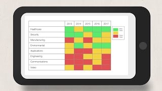
A heatmap is a data visualization tool that shows you where users click, tap, scroll, and move their mouse on a web page. The tool assigns colors based on activity volume: areas with many interactions show up in warm colors (red, orange, yellow), while ignored areas appear in cool colors (blue, green, or grey).
The word "heatmap" comes from the idea of thermal imaging. Just like an infrared camera shows hot and cold spots on a surface, a website heatmap shows "hot" (popular) and "cold" (ignored) areas on your page.
Heatmaps were first applied to website data in the early 2000s. The concept itself dates back to 1873, when French statistician Toussaint Loua used shading to visualize social statistics across districts of Paris. Today, tools like Microsoft Clarity and Hotjar (now part of Contentsquare) generate heatmaps automatically from real visitor data, requiring no extra setup beyond adding a tracking script to your site.
The Four Types of Heatmaps
Each heatmap type records a different kind of user behavior. Use them together for a full picture.
1. Click Maps
A click map shows every place a user clicks (on desktop) or taps (on mobile). It answers: "What are people trying to interact with?"
Click maps reveal three critical insights:
- Which CTAs (calls-to-action) are getting clicks: so you know what is working
- Rage clicks: when a user clicks the same spot repeatedly out of frustration (usually a broken element or something that looks clickable but is not)
- Click leakage: when users click on non-linked images, text, or design elements that they expect to be clickable
2. Scroll Maps
A scroll map shows how far down a page users scroll before leaving. The top of the page shows 100% of visitors. As you move down, the percentage drops. The color shifts from warm to cool as fewer users see that content.
Scroll maps answer: "How much of this page do people actually read?"
The average user reads only 20-28% of the words on a page (source: Nielsen Norman Group). Scroll maps show exactly where they stop.
3. Move Maps (Mouse-Tracking Maps)
A move map tracks where users move their mouse cursor on desktop. Research shows that mouse movement and eye gaze are correlated about 84% of the time (source: academic research published in Behaviour & Information Technology).
This means move maps are a cheap approximation of what people are looking at, without needing eye-tracking hardware.
4. Attention Maps
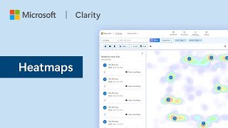
Attention maps combine click, scroll, and move data to generate an overall "attention score" per section of the page. They use AI to estimate where users are truly focused. Tools like Microsoft Clarity generate these automatically.
How Heatmaps Work (Technically)
You do not need to understand the technical details to use heatmaps effectively. But a basic understanding helps you interpret the data correctly.
- You add a JavaScript snippet to your website. This is a short piece of code that the heatmap tool gives you. You paste it into your site, or install it via Google Tag Manager.
- The script records user interactions, every click, scroll position, and mouse movement is logged and sent to the tool's servers.
- The tool aggregates the data across all users and generates a visual overlay. When you view a heatmap, you are seeing the combined behavior of potentially thousands of users layered onto a screenshot of your page.
Most heatmap tools capture data continuously. You can view heatmaps for any time period, any device type (mobile vs desktop vs tablet), and any segment of users.
Common mistake: looking at heatmaps on the wrong device.
A desktop heatmap and a mobile heatmap of the same page will look completely different. On mobile, elements stack vertically, so the page is much longer. A button that is "above the fold" (visible without scrolling) on desktop might be far below the fold on mobile. Always filter your heatmap by device type before drawing conclusions. Most beginners make decisions based on desktop data when 60%+ of their traffic is on mobile.
The F-Pattern and Z-Pattern: How Users Actually Read Pages
Two research findings from Nielsen Norman Group (one of the world's leading UX research firms) fundamentally change how you should design and analyze pages.
The F-Pattern
When users scan text-heavy pages (like articles, blog posts, or search results), they read the first line fully, then scan down the left side, occasionally darting right to read a few words. The heatmap of this behavior looks like the letter F. The right side of the page gets almost no attention.
The Z-Pattern
On pages with less text (like landing pages or homepages), users scan left to right, then diagonally down to the bottom left, then left to right again. The heatmap looks like the letter Z.
What This Means for Your Pages
- Put your most important content on the left side and near the top
- Do not put critical CTAs only in the right column
- The first two lines of any section get the most attention, make them count
Reading a Heatmap: A Step-by-Step Process
Step 1, Install the tool and wait for data
You need a minimum of 500 sessions to get a reliable heatmap. With fewer sessions, random behavior skews the results. Most small websites take 2-4 weeks to collect enough data on a single page.
Step 2, Filter by device first
Always split desktop and mobile before reading anything. Check which device sends you more traffic in Google Analytics 4 first, then start with that device.
Step 3, Read the click map
Look for:
- Are users clicking your primary CTA?
- Are users clicking elements that are not clickable (like headers or images)?
- Are there rage clicks anywhere? (Rage clicks show up as concentrated red dots)
Step 4, Read the scroll map
Find the "fold", the point where 50% of users have stopped scrolling. Any important content or CTA below that line is being seen by less than half your visitors.
Step 5, Form a hypothesis
Translate what you see into a specific problem statement. Not "the page is confusing" but "users are clicking the product image thinking it links to the product page, but it does not, this is causing frustration."
Step 6, Test a fix
Change one element at a time. Use A/B testing if you have the traffic volume (minimum 100 conversions per variant for statistically reliable results). Run the test for at least 2 weeks to account for weekly traffic patterns.
Real Company Examples
Example 1: Associated Spring Raymond, 130% More Form Conversions
Associated Spring Raymond (ASR), a custom springs manufacturer, used heatmap analysis to diagnose problems with their 3D online catalog. TopSpot, their marketing agency, installed heatmap software on the product catalog pages.
The heatmaps showed users repeatedly clicking "See More Results" instead of using the product filters. This meant the filters were not helping users narrow their search, they were scrolling endlessly instead.
The team redesigned the page to use a horizontal product search with fewer, clearer filter options. They tested it first on the Gas Struts category.
Results after the redesign:
- Form submissions for Gas Strut products: 130.65% increase
- Form conversion rate: 126.12% increase
- Form abandonment: 35.59% decrease
The fix required no change to the product catalog itself, only the navigation and filter layout changed.
Example 2: Muc-Off, 25% More Conversions Using AI Heatmaps
Muc-Off, a UK-based cycling and motorcycle cleaning products brand, implemented AI-powered heatmap analysis across their e-commerce site. By analyzing which product images received the most clicks and which page sections were ignored, they identified key layout issues on their product detail pages.
After redesigning the page layout based on heatmap insights, moving the "Add to Cart" button higher and reorganizing product information:
- Conversions increased by 25%
- Bounce rates decreased by 30%
The changes took less than a week to implement after the heatmap analysis was complete.
How to read a scroll map in 60 seconds:
Open your scroll heatmap. Find the first point where the color shifts from orange/yellow to blue. That is your "scroll fold", the depth below which fewer than 30% of users scroll. Now ask yourself: "Do I have any important CTAs, testimonials, or pricing information below this line?" If yes, you have found a conversion leak. Move that content above the fold or redesign the page so users are motivated to scroll further.
What Heatmaps Cannot Tell You
Heatmaps are powerful but limited. Understanding what they cannot do is just as important as knowing what they can do.
| What heatmaps show | What heatmaps cannot show |
|---|---|
| Where users click | Why users click there |
| How far users scroll | Why users stop scrolling |
| Which areas get attention | What users think about those areas |
| Which CTAs are ignored | Why users are ignoring the CTAs |
To answer the "why" questions, you need:
- Session recordings (watch individual users navigate your page)
- Exit surveys (ask users why they are leaving)
- User interviews (talk to real customers)
- Funnel analysis (see which step has the highest drop-off rate)
The best practice is to use heatmaps to identify where the problem is, then use qualitative methods to understand why.
Free vs Paid Tools: What to Use
| Tool | Cost | Session Limit | Key Strength |
|---|---|---|---|
| Microsoft Clarity | Free forever | Unlimited | Best free option, AI summaries, 2M+ sites |
| Hotjar (Contentsquare) | Free tier: 200k sessions/month | 200k/month | Adds surveys and NPS widgets |
| Crazy Egg | Paid from $29/month | Varies by plan | Long-standing tool, strong A/B testing integration |
| Lucky Orange | Paid from $19/month | Varies | Real-time heatmaps while user is still on site |
| FullStory | Enterprise pricing | Unlimited (enterprise) | Most detailed session data, DX analytics |
Start with Microsoft Clarity. It is completely free, requires no credit card, captures 100% of your traffic (no sampling), and takes under 10 minutes to install. It is deployed on over 2 million websites globally.
Once you have validated that heatmap data improves your decision-making, upgrade to a paid tool if you need surveys or more advanced features.
Pro tip: combine Clarity with GA4.
Microsoft Clarity integrates directly with Google Analytics 4. Once connected, you can open a heatmap for any specific segment from GA4, for example, "show me a heatmap of only users who came from a Google Ads campaign and did NOT convert." This tells you exactly where paid traffic is leaking, which is far more actionable than looking at all traffic combined.
Common Mistakes to Avoid
-
Reading heatmaps without enough data. Under 500 sessions, the map is noise, not signal. Wait longer or run the analysis on a higher-traffic page.
-
Ignoring mobile. More than 60% of web traffic globally comes from mobile devices. If you only analyze desktop heatmaps, you are optimizing for the minority of your visitors.
-
Making changes without A/B testing. A heatmap shows you a problem. It does not tell you which solution is correct. Test your hypothesis before rolling it out to 100% of users.
-
Obsessing over individual clicks. One user clicking somewhere unusual is meaningless. Look for patterns across hundreds or thousands of sessions.
-
Not segmenting by traffic source. Users from paid ads behave differently from organic search visitors. A heatmap of all traffic mixed together hides these differences. Segment to find the real insights.
The One-Line Takeaway
If users are not clicking your most important button, move it to where they are already clicking, the data is right there in the heatmap.