Visual Identity Systems
In 2025, your audience forms a brand impression in under 10 seconds. A visual identity system is the difference between a brand that sticks and one that disappears into the feed.
Quick Summary
- A visual identity system is far more than a logo: it is a coordinated set of rules covering color, type, imagery, iconography, and layout
- Consistent visual identity increases revenue by up to 23% and drives 3.5x greater market visibility, according to Lucidpress and Kantar Millward Brown
- Companies without a codified system lose consistency every time a new hire joins or an agency rotates in
- The build sequence matters: strategy first, logo last
- Design tokens and a shared asset library are the two most underused tools for maintaining consistency at scale
What It Actually Is
A visual identity system is a documented set of rules that governs how a brand looks across every surface it appears on. It covers the logo and all its variants, the color palette with exact hex and CMYK values, the type hierarchy, the photography and illustration style, and the spacing and layout principles that tie it all together.
Think of it like a constitution for your brand's appearance. The constitution does not tell you what to say on any given day, but it sets the rules that every decision must follow. Without it, every new designer, agency, or intern makes their own calls, and the brand slowly fractures into a dozen incompatible versions of itself.
A brand with a strong visual identity system: Apple. Walk into any Apple Store, open any product box, visit apple.com, or watch a keynote. The same font, the same photography style, the same use of white space, the same product photography angles. That is not coincidence. It is a system enforced at every level of production.
Why It Matters (with data)
The case for investing in a visual identity system is not aesthetic, it is financial.
- 23% average revenue increase from consistent brand presentation across all channels, per Lucidpress brand consistency research
- 3.5x greater market visibility in crowded categories for brands with consistent identity, per Kantar Millward Brown
- 80% improvement in brand recognition from consistent color palette usage alone, per University of Loyola research cited in Amra and Elma's 2025 brand statistics roundup
- 68% of companies report 10-20% revenue growth directly linked to brand consistency programs, per Forrester Research
- Inconsistent brands require 1.75x more media budget to achieve equivalent results as consistent brands, per Nielsen Media Efficiency Report
- 22.4% price premium that consumers will pay for brands they rate as highly consistent and trustworthy, per PwC Consumer Insights
- 60% of consumers say they will skip a brand if the logo looks unprofessional, even if the product is superior
These numbers explain why brand consistency ranks as "critical" or "highly important" by 77% of CMOs surveyed. The visual system is not a design project. It is a revenue infrastructure decision.
The logo-only trap: Many companies spend $5,000-$50,000 on a logo, then apply it inconsistently across decks, social posts, email headers, and product UI. Without a system governing color, type, spacing, and imagery, even a world-class logo cannot create the recognition that drives the revenue numbers above.
How It Works: The Five Pillars
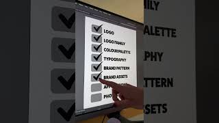
A complete visual identity system has five components. Each one must be documented with specific, actionable rules, not vague principles.
1. Logo Suite
A logo system is not one file. At minimum you need:
- Primary logo: full horizontal or stacked lockup, for most applications
- Icon or mark only: for small placements, favicons, app icons, profile photos
- Wordmark only: for contexts where the icon adds noise rather than recognition
- Light and dark variants: of each of the above
Export all variants as SVG for digital use and PNG at 2x resolution as a fallback. Define minimum size rules (e.g., the icon should never appear smaller than 24x24px) and clear space rules (minimum padding around the logo equal to the cap height of the wordmark).
2. Color System
Color carries more recognition load than any other visual element. A functional color system specifies:
- Primary color: the dominant brand color for CTAs, headers, and key UI elements
- Secondary colors: 1-3 supporting colors for variety without chaos
- Neutral colors: backgrounds, body text, borders, dividers
- Semantic colors: success (green), warning (yellow), error (red), info (blue)
Every color must be specified in HEX (for digital), RGB (for screens), and CMYK (for print). If your brand touches print at any point, also specify a Pantone match. Color values that are "close enough" cost you recognition at the exact moment you need it most.
3. Typography
Type signals personality before a single word is read. A complete type system includes:
- Display or heading font: for H1 and H2, where personality and impact matter most
- Body font: optimized for reading at 14-18px, must be legible at scale
- Mono font: optional, for code blocks, data tables, or technical contexts
Document the full scale: font sizes, line heights, letter spacing, and weight usage for each heading level and body text variant. "Use bold for important things" is not a spec. Exact values are.
4. Imagery and Photography Style
Photography direction is almost always missing from early brand guidelines. It shows up the first time someone publishes an image that looks completely off-brand. Define:
- Subject matter: people, products, abstract, environmental, lifestyle
- Color treatment: high contrast, muted, warm, desaturated
- Composition rules: centered subjects, rule of thirds, heavy negative space
- Exclusions: specific stock photo cliches to avoid, competitor brand colors appearing in frame, distracting backgrounds
5. Iconography and Illustration
Icons and illustrations should feel like they came from the same hand. Specify:
- Style: line, filled, duotone, hand-drawn, flat
- Stroke weight and corner radius: the details that unify a set
- Approved icon library: if using a third-party set, name the exact library and version so future contributors use the same one
The Visual Identity Build Process
The sequence matters as much as the components. Jumping to logo design before strategy is the most common and costly mistake.
Each stage feeds the next. The color system should reinforce the positioning, not just look nice. The typography should complement the logo, not fight it. When you skip steps, you end up rebuilding.
If you have nothing and need to start today: pick your primary brand color and your heading font first. These two decisions have the highest leverage in making your materials look intentional. Everything else can come next. A consistent color and typeface used across a dozen assets will outperform an inconsistent full system every time.
Building Your Brand Guidelines Document
The brand guidelines document, sometimes called a style guide or brand book, is the operational manual for the system. It only works if it is specific enough to answer real questions without a designer in the room.
A complete document includes:
- Brand overview: mission, positioning, target audience, personality words
- Logo usage: approved lockups, clear space rules, minimum sizes, what never to do
- Color palette: all colors with HEX, RGB, CMYK, and Pantone values, with usage guidance
- Typography: full hierarchy with size scales, line heights, weights, and examples
- Photography and imagery direction: with good and bad examples side by side
- Iconography and illustration: style guide with approved libraries
- Application examples: mockups of the system applied to a business card, email header, social post, presentation slide, and product UI
The application examples are the most skipped and most important section. Without them, every person who receives the guidelines will interpret the abstract rules differently. Concrete mockups eliminate ambiguity.
Maintaining Consistency at Scale
Identity systems degrade. As new team members join, agencies rotate in and out, and design tools change, drift accumulates. A brand that looked tight at launch can become fragmented within 18 months without active maintenance.
Protect consistency with four mechanisms:
- Single source of truth: one shared library (Figma, Canva for Teams, or equivalent) where all approved assets live. If approved files are scattered across Dropbox folders and email threads, the system is already breaking.
- Design tokens: if you have a product, website, or app, encode colors and type as variables rather than hardcoded values. When you update a token, every component updates with it. This is how large teams maintain consistency without manually hunting down every hex value.
- Quarterly audits: review public-facing materials every quarter: website, social profiles, email templates, presentation decks, ad creative. Correct drift before it compounds.
- Onboarding integration: brand guidelines should be part of every new hire and every agency brief from day one. Not a document they discover six months later after they have already produced non-compliant materials.
Real Company Examples
Airbnb: The Belo Rebrand (2014)
Global home-sharing platform, 2014 rebrand by DesignStudio No coherent visual system existed before 2014 despite scaling into a fast-growing global platform Introduced the Belo symbol, a custom Cereal typeface, coral (#FF5A5F) as the primary color, and a warm human-centered photography direction applied consistently across app, web, and physical touchpoints
Result: Brand value grew 21.8% in 2023, making it Interbrand's fastest-growing brand that year, jumping from #54 to #46 in the Best Global Brands ranking (2014-2023).
SourceBefore 2014, Airbnb had no coherent visual system. The rebrand by DesignStudio introduced a complete identity system that has scaled to 100+ countries without fracturing:
- The Belo symbol: designed to read simultaneously as a location pin, a heart, the letter A, and a person. Within three years it was one of the most recognized marks in the travel category.
- Coral as primary brand color (#FF5A5F): a warm, inviting tone that differentiated Airbnb from the cold blues dominant in tech at the time.
- Cereal typeface: a geometric sans-serif commissioned specifically for Airbnb, ensuring no other brand could use the same type.
- Photography rooted in belonging: warm-lit, human-centered images shot in real homes, not staged sets.
By 2023, Interbrand valued Airbnb's brand at $12.6 billion. The identity system was not an aesthetics project. It was infrastructure that made global recognition possible.
Oatly: Visual Identity as Competitive Weapon (2024)
Global oat-milk brand, packaging and retail touchpoints, 2023-2024 Wanted the product to stand out on a crowded dairy-alternative shelf without a large media budget Used a consistent irreverent visual identity, hand-drawn type, off-white packaging, long zine-style copy, across cartons, the website, and oat-milk cups in coffee shops
Result: Gross profit grew from $32.6 million in 2023 to $62 million in 2024, outpacing its category (2023-2024).
SourceOatly built a deliberately irreverent visual identity using hand-drawn type, off-white packaging, and long-copy packaging text that reads more like a zine than a product label. Every touchpoint from the carton to the website to the oat-milk cups in coffee shops uses the same visual voice.
The results are measurable: Oatly's gross profit grew from $32.6 million in 2023 to $62 million in 2024, outpacing its category. The visual identity is a core reason Oatly products, as Octopus Intelligence's 2025 analysis noted, "leap off the shelves ahead of competitors."
Common Mistakes
1. Treating the logo as the entire identity The logo is one component of a system. Spending the entire brand budget on a logo and leaving nothing for color, type, and guidelines documentation produces a beautiful mark that gets applied inconsistently everywhere.
2. Specifying colors without multiple formats Defining brand colors only in HEX means the print team guesses the CMYK equivalent and the result looks different on physical materials. Always specify HEX, RGB, CMYK, and Pantone from the start.
3. Missing application examples in guidelines Abstract rules like "use the primary color for calls to action" get interpreted differently by every designer. Show what it looks like on an actual button, an actual email, an actual ad. Concrete beats abstract every time.
4. No enforcement mechanism A brand guidelines PDF that sits in a shared drive and is never referenced is not a system. Without a shared asset library, a regular audit process, and integration into onboarding, the guidelines are decoration.
5. Designing before the strategy is done The most expensive mistake: starting logo development before positioning is settled. A rebrand triggered by a pivot in brand strategy costs far more than taking two extra weeks to nail the positioning first.
Key Takeaways
- A visual identity system is a revenue infrastructure decision, not just a design choice
- Consistent brands earn a 22.4% price premium and need 1.75x less media spend to hit the same awareness levels
- All five pillars must be documented: logo suite, color system, typography, imagery direction, iconography
- The build sequence is non-negotiable: strategy first, logo development later
- Design tokens plus a shared asset library are the two most effective tools for maintaining consistency as teams and agencies scale
- Application examples in your guidelines document are not optional: they are what makes the rules actually get followed