Building a Brand Book
95% of companies have brand guidelines, but only about 25% actively enforce them, a gap that has held steady for years. That gap is where brand equity quietly leaks out every day.
Quick Summary
- A brand book is a single reference document covering visual identity (logo, colors, fonts) and verbal identity (tone, voice, messaging)
- Consistent brand presentation increases revenue by up to 33% according to Lucidpress research
- The biggest failure mode is not building the book, it is building it and never distributing it
- A brand book must be structured in layers: foundation first, execution rules last
- Living digital versions outperform static PDFs because they can be updated without resending files
What It Actually Is
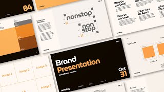
A brand book, also called a brand style guide or brand bible, is a single document that tells every designer, writer, agency, and partner exactly how to represent your brand. It covers what colors to use (with exact hex codes), how the logo may and may not appear, what the brand sounds like in writing, and what words to avoid.
Think of it like a franchise operations manual. A McDonald's franchisee in Mumbai and one in Manchester follow the same manual. That is why the golden arches look identical and the employee uniform is the same. A brand book does the same thing for your visual and verbal identity. Without it, every collaborator improvises, and the result is a brand that looks like a different company on every channel.
Why It Matters (with data)
The business case for a brand book is well-documented and growing stronger:
- Consistent brand presentation across all platforms can increase revenue by up to 33%, according to Lucidpress/Marq research
- 68% of companies report brand consistency directly contributed to revenue growth
- A consistent signature color alone lifts brand recognition by up to 80% (Loyola University)
- Brands that maintain consistent presentation are 3.5x more likely to achieve revenue growth than inconsistent competitors, per Forrester
- 79% of consumers show greater loyalty to brands with consistent communication (Salesforce, 2024)
- The cost of inconsistency is not just lost sales: brand compliance failures average $1.4 million per year in wasted budget and recreated assets
Yet the adoption gap is staggering. Research aggregated by OmniBound in 2025 found that 81% of organizations still produce off-brand content despite having guidelines in place. The problem is almost never the guidelines themselves. It is that no one can find them, they are outdated, or they are too long to read.
A brand book closes that gap. It makes the rules findable, current, and short enough to act on.
Airbnb released its full brand identity system in 2014 alongside a public brand book built around its new logo, 'The Belo.' The document defined exact color values (Rausch red: #FF5A5F), typeface rules (Circular font family), and photography guidelines covering light, composition, and subject mood. By 2022, Airbnb had over 6 million active listings across 220+ countries, all using the same visual language, without a central creative team approving every asset. The book was published openly, which also built trust with hosts and partners who could verify they were using official brand elements.
How It Works: The Playbook
A brand book is built in five layers, from the most abstract to the most concrete. Build it top-down. Teams use it bottom-up.
Layer 1: Brand Foundation
Uber's in-house brand team, working with the agency Wolff Olins, on the 2018 global brand identity refresh Uber had grown from a Silicon Valley ridesharing app into a brand operating across 60+ countries, and its visual and verbal identity had never been codified into a foundation that worked the same way everywhere Before writing a single visual or usage rule, the team spent over 1,000 hours listening to drivers, riders, and local teams across global markets to define the brand's foundational mission and positioning before locking any color, font, or logo rule
Result: a foundation layer built from 1,000+ hours of global research, used to justify every downstream visual and verbal rule in the resulting brand system (research phase ran roughly a year before the September 2018 rebrand launch).
SourceWrite your mission, core values, and positioning statement. This is the 'why' behind every rule that follows. Without it, rules feel arbitrary and people skip them.
- Keep this section to one page
- Include who your audience is and what makes you different
- Avoid vague aspiration like "we put people first" unless you can show what that means in practice
Layer 2: Verbal Identity
This section tells every writer how the brand sounds.
- Tone of voice: formal vs. casual, warm vs. authoritative, playful vs. serious
- Vocabulary list: words to use and words to avoid (e.g., "simple" yes, "leverage" no)
- Before-and-after rewrites: show the same sentence written on-brand and off-brand
- Approved taglines and headline formulas
- Grammar preferences: Oxford comma yes or no, how to handle numbers, etc.
Layer 3: Visual Identity
This is the most-used section by designers and external partners.
- Logo: primary version, secondary versions, minimum size, clear space rules, forbidden alterations
- Color palette: primary and secondary colors with hex, RGB, and CMYK values for every color
- Typography: approved typefaces, weights, sizes, and line-height rules for headings, body, and captions
- Iconography: approved icon style, stroke weight, and sizing
- Photography and illustration: mood, subject, lighting, composition rules
Layer 4: Usage Rules
Show correct and incorrect applications side by side. Cover the most common errors:
- Stretching or rotating the logo
- Using an off-brand color as a background
- Mixing two different fonts that are not in the approved set
- Writing in a tone that does not match the brand voice
- Placing the logo on a background with too little contrast
Label mistakes clearly. "Never do this" is more memorable than "avoid."
Layer 5: Distribution
IBM's Carbon Design System team, distributing brand and UI standards as a living, versioned, open-source system instead of a static PDF IBM's design and brand rules were previously scattered across static documents that different product teams interpreted inconsistently, slowing every new build and producing visibly off-brand products IBM rebuilt its guidelines as Carbon, a continuously updated open-source design system with code, components, and documentation in one linked hub that any team, inside or outside IBM, could pull from directly
Result: teams building with Carbon completed a simple form page 47% faster than coding from scratch (median 2 hours versus 4.2 hours), and IBM's own tracking found an average of 2,000 developer hours saved per product offering (ongoing since Carbon's public release, measured in a 2022 Sparkbox value study).
SourceA PDF no one can find is useless. This layer is where most brand books fail.
- Host the brand book in a tool that is always linked from your team wiki, your new-hire onboarding checklist, and your agency briefing template
- Use a living digital version (Frontify, Notion, or a hosted URL) so updates happen without resending files
- Include the brand book URL in every agency contract and freelancer brief
- Set a calendar reminder to review and update it every 12 months
Keep each section to one page where possible. Brand books that run 80 pages rarely get read. If a rule requires three pages of explanation, simplify the rule. The best brand books are short enough that people read them and specific enough that people can act on them. A 20-page book that gets used beats a 100-page book that sits in Dropbox.
What to Leave Out
Brand books bloat when teams try to pre-answer every possible question. Resist this. Cut:
- Campaign-specific creative: that belongs in a campaign brief, not the brand book
- Company history longer than two sentences: people do not read it and it dates quickly
- Internal legal language: link to the legal doc, do not paste it
- Aspirational copy with no actionable output: "we believe in authenticity" is not a rule
- Detailed product specs: those belong in product documentation
Every page that does not help someone make a faster, more on-brand decision makes the book harder to use overall.
Real Company Examples
Mailchimp: Voice Before Visuals
Mailchimp built its brand book around voice first, not visuals. The Mailchimp Content Style Guide, published publicly on styleguide.mailchimp.com, runs to dozens of sections on tone, grammar, and vocabulary. The company identified that its biggest consistency problem was not logo misuse but copywriters across 20 teams writing in completely different tones. By publishing the style guide publicly, Mailchimp also turned it into a marketing asset. Thousands of marketers discovered the brand by reading its style guide. By 2021, when Intuit acquired Mailchimp for $12 billion, that consistent brand voice was cited by analysts as a core asset of the company.
Spotify: A System, Not a Document
Spotify's brand guidelines (brand.spotify.com) are not a PDF. They are a living website updated in real time as the design team iterates. The system covers Spotify Green (#1DB954 in hex), the Circular typeface license, and rules for using artist imagery without obscuring album art. Spotify distributes the guidelines as a URL embedded in every partner agreement. By 2025, Spotify had over 600 million monthly active users across 180+ markets. Every playlist thumbnail, podcast banner, and wrapped campaign card follows the same visual system, despite most assets being created by third-party artists, labels, and podcast networks who never spoke to Spotify's internal design team.
Spotify's brand guidelines site includes a color accessibility checker. Enter any background and foreground combination, and the tool tells you whether the contrast ratio meets WCAG accessibility standards. This is a 2025 best practice: embed interactive tools directly into the brand book so teams do not have to leave it to do their work. The result is a brand book that functions as a productivity tool, not a rulebook.
Common Mistakes
1. Building the book and never distributing it. This is the number one failure mode. A brand book sent once in a Slack message and never linked from onboarding or contracts is just a document. Distribution is not an afterthought. It is a core deliverable. Build the distribution plan before you write the first page.
2. Leaving out real examples. Rules without examples are abstract. "Use a warm, conversational tone" means nothing until you show two versions of the same sentence: one on-brand and one off-brand. Every verbal rule needs a before-and-after pair.
3. Never updating it. A brand book written in 2021 with outdated logo variants and colors from a rebrand that has since changed is actively harmful. Teams follow it believing they are correct, while producing off-brand work. Schedule a mandatory review every 12 months. Treat the brand book as a versioned document, not a finished artifact.
4. Skipping the verbal identity section. Most teams spend 80% of their brand book on visual rules and two paragraphs on tone of voice. The result is a brand that looks consistent but sounds completely different on every channel. Voice and vocabulary rules are as important as color codes.
5. Making it too long. Research from Frontify consistently shows that brand books over 50 pages have significantly lower adoption rates. Length signals that the team tried to answer every question in advance rather than writing clear, memorable rules. If you cannot explain a rule in one paragraph, the rule is too complex.
Key Takeaways
- A brand book is a coordination tool, not a creative constraint: it speeds up decision-making by eliminating the need to redecide foundational choices
- Build in five layers: foundation, verbal identity, visual identity, usage rules, and distribution plan
- Consistent brand presentation can increase revenue by up to 33%, but 81% of organizations still produce off-brand content despite having guidelines
- Voice and tone rules are as important as color codes: include before-and-after rewrites, not just style descriptions
- A living digital URL beats a static PDF because it updates without requiring redistribution
- Distribution is a deliverable: link the brand book in every contract, onboarding doc, and agency brief before you consider it done