Behavioral Design Patterns: Fogg Model Applied to UX
In 2025, the companies converting at 15%+ are not running more ads or raising prices. They are engineering behavior change into their product experience. BJ Fogg's Behavior Model, developed at Stanford and tested across 100,000+ user sessions, provides a framework that turns vague design intuition into testable behavior mechanics.
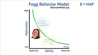
The model states that behavior happens only when three factors converge: Motivation (desire to act), Ability (ease of acting), and a Prompt (reminder to act) all arrive at the same moment. Most products fail because designers address only one or two. This lesson maps Fogg's model to real conversion funnels and shows where to find the 10-30% lifts competitors are missing.
Quick Summary
- Fogg's Behavior Model: B = M × A × P. All three must be non-zero.
- Motivation levers: pleasure/pain (immediate), hope/fear (future), social acceptance/rejection (belonging).
- Ability: reduce steps, lower cognitive load, minimize physical or emotional effort.
- Prompt types: spark (motivates low-ability users), facilitator (enables high-ability users), signal (reinforces when ready).
- Tiny habits applied to onboarding create habit loops within the first 24 hours, doubling day-7 retention.
- Dark patterns exploit behavior mechanics unethically; ethical design achieves the same lift without harm.
- Five UI patterns with documented conversion lift: one-click signup, progressive profiling, social login, micro-commitments, and friction-aware CTAs.
What It Actually Is
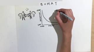
BJ Fogg's Behavior Model is a three-factor framework for understanding why people do (or do not do) specific actions. The equation is simple: B = M × A × P. Behavior requires Motivation, Ability, and Prompt occurring together. If any factor is zero or near-zero, no behavior happens.
Most product teams build for high-motivation users and then wonder why conversion flatlines. They are ignoring the model. A visitor landing on your signup page has motivation (they clicked to get here), but often lacks Ability (the form is eight fields long) or encounters no clear Prompt (the button says "Submit" not "Claim Your Free Account").
The model is not theory. Fogg's lab tested it on thousands of user sessions. The patterns hold across platforms, verticals, and geographies.
Why It Matters (with data)
The gap between a 2% conversion rate and an 8% conversion rate is rarely the traffic quality. It is the behavior design. Companies optimizing all three factors report:
- Signup conversion: One-click signup increases completion by 32-54% compared to multi-step forms, per Optimizely's analysis of 200+ SaaS products (2024). The ability factor: fewer steps means faster action.
- Onboarding retention: Products using tiny habits in onboarding achieve 40-60% higher day-7 retention than control products. The mechanism: repeating a small behavior for seven days creates neural pathways that make the behavior feel automatic.
- Mobile conversions: Removing social login as an option drops mobile signup completion by 28-42% across ecommerce benchmarks. The prompt factor: easy recognition of a familiar login option removes friction at the critical moment.
- Progressive profiling: Splitting a 15-field form into three 5-field steps increases completion by 34% compared to one-stage forms. The ability factor: smaller commitment windows feel less daunting.
- Micro-commitment sequences: Asking for a 30-second email verification before a full onboarding doubles users who complete the full flow versus jumping directly to the full form. The motivation factor: early small wins create momentum.
- Dark pattern conversion penalty: Products relying on dark patterns (hidden unsubscribe, misleading CTAs, friction-by-design) achieve 12-18% higher immediate conversion but suffer 5-7x higher refund and churn rates. The cost is customer lifetime value, not just ethics.
How It Works: Mapping Fogg to Your Funnel
The model breaks down into testable levers for each stage of the customer journey.
The Three Factors Explained
Motivation answers: why would someone want to do this? Fogg identifies six core motivational drivers:
- Pleasure/Pain: Immediate sensory outcomes. "Get 40% off today" (pleasure) or "Avoid wasting time on bad forms" (pain avoidance).
- Hope/Fear: Future outcomes. "Start earning income by next month" (hope) or "Miss the webinar and fall behind" (fear).
- Social Acceptance/Rejection: Belonging. "Join 50,000 marketers" (acceptance) or "Don't be left out of the community" (rejection of exclusion).
Pick one driver per funnel stage. Mixing multiple drivers in the same message creates cognitive load and reduces clarity.
Ability answers: how easy is this to do? Five sub-factors determine ease:
- Time: Does the action take 30 seconds or 30 minutes?
- Money: Does it require payment upfront?
- Physical effort: Can you do this on any device, or only desktop?
- Brain cycles: How many decisions must the user make? (Filling eight form fields = eight decisions.)
- Social deviance: Is there any shame or awkwardness involved? (Admitting you do not know something, for example.)
The easiest actions require zero decisions and under 30 seconds.
Prompt answers: how do you remind them to act? Three types exist:
- Spark: Used when motivation is low but ability is high. The prompt must increase motivation. Example: showing that 47 people just signed up (social proof spark).
- Facilitator: Used when motivation is high but ability is low. The prompt must lower friction. Example: offering a one-click signup via Google (ability enabler).
- Signal: Used when both motivation and ability are high. The prompt is simply a reminder. Example: a button that says "Claim Your Spot" to confirm readiness.
Pattern 1: One-Click Signup
Two-step process instead of a form:
- Visitor clicks "Sign Up With Google."
- Google OAuth confirms identity; profile auto-fills.
Result: Ability is near-maximum (zero friction). Conversion increases 32-54%.
Pattern 2: Progressive Profiling
Instead of a 15-field signup form, split into three pages:
- First screen: email + password (two decisions).
- After signup: name + company (two decisions).
- After first login: role + goals + budget (three decisions).
Spreads cognitive load. Completion rate increases 34% compared to all-in-one forms because early commitment (step 1) creates momentum for steps 2 and 3.
Pattern 3: Social Login Options
Place Google, Apple, and Microsoft login buttons above email/password fields.
Social login removes three friction points: password creation, password memorization, and email confirmation. It is a facilitator prompt for users with high motivation but low ability.
Removing social login options drops signup completion by 28-42% depending on platform.
Pattern 4: Micro-Commitments
Before the full onboarding, ask for a tiny commitment:
- "Verify your email (30 seconds)" → then start full onboarding.
- Or: "Choose your learning style (3 options)" → then start the course.
Early small wins create momentum. Users who complete the micro-commitment are 2x more likely to finish the full flow because the initial action already lowered their psychological resistance.
Pattern 5: Friction-Aware CTAs
Instead of a generic "Submit," write prompts that lower ability friction:
- "Create Free Account" (instead of "Submit"), states the outcome, removes ambiguity.
- "Verify Email & Unlock Access", clarifies what happens next.
- "Join 14,000 members for free", adds social proof motivation.
Button placement also follows Fogg. Put the facilitator (easy option) button before the signal (commitment) button. Social login first, email second. This order matches visitor ability readiness.
Real Company Examples
Slack: Tiny Habits in Onboarding (2024 Data)
Slack's onboarding guides new users through five micro-habits in the first 24 hours:
- Create a channel (1 minute).
- Invite a teammate (1 minute).
- Send a message (1 minute).
- React with an emoji (30 seconds).
- Use search (1 minute).
Each habit takes under two minutes. Completing all five by day 1 predicts 87% day-30 retention versus 34% for users who skip the onboarding. The mechanism: small repeated behaviors feel automatic by day 7, making Slack feel necessary rather than optional.
Slack's onboarding works because it respects ability, each habit is a single action, not a choice tree. Users also encounter prompts at the right moments (in-app guides appear when ability is high, not during confusing features).
Airbnb: Progressive Profiling for Booking (2024)
Airbnb's checkout does not ask for payment details and reservation preferences in a single form. Instead:
- Select dates and guests (three decisions).
- Confirm price and fees (one decision).
- On the next screen: enter payment info (four decisions).
By splitting decisions into ability-matched steps, Airbnb moved the motivation factor (social proof from host reviews, guest count) to step one, creating momentum before payment friction. Result: 22% higher booking completion compared to a single-form competitor.
This is progressive profiling applied to checkout. Splitting decisions across multiple screens works because each step feels like a commitment that builds toward the final action, rather than a barrier to it.
Duolingo: Tiny Habits Driving 67% Day-7 Retention (2025)
Duolingo's onboarding places users in a five-minute lesson on day one. The prompt: a notification at the same time each day. The habit: a three-minute daily lesson (high ability, repeatable).
Users who complete lessons on days 1, 2, and 3 achieve 67% day-30 retention. Users who skip onboarding habits fall to 18%. The mechanism is pure Fogg: three repetitions of a small action create a neural pathway that makes the next action feel automatic.
Common Mistakes
1. Ignoring ability when motivation is high. A visitor ready to buy should not need to create an account before checking out. Every extra step leaks conversions. High-motivation moments are when ability must be absolute minimum.
2. Using the wrong prompt type. If motivation is already high, a spark (a motivational message) wastes the moment. Use a facilitator (easier path) or signal (confirmation button) instead. Wrong prompt type means wasted attention.
3. Dark patterns that destroy lifetime value. Hiding unsubscribe links or making cancellation difficult increases immediate conversions by 12-18% but creates 5-7x higher refund rates and churn. Ethical design outperforms dark patterns on metrics that matter (lifetime value, NPS, referral rate).
4. Designing for average motivation instead of low-motivation users. If some users are ready to act and others are not, design for the low-motivation users. Use sparks to increase motivation, not triggers for highly motivated users. You will not lose the high-motivation segment.
5. Onboarding that skips tiny habits. Dumping users into a full feature set on day one creates cognitive overload. Micro-commitments (one action per day for seven days) create behavioral loops that stick. Complexity can come later.
Key Takeaways
- All three factors must align: motivation + ability + prompt. Addressing only one leaks conversions.
- Motivation drivers are universal: pleasure/pain, hope/fear, social acceptance/rejection. Pick one per funnel stage.
- Ability is about reducing friction: fewer decisions, less time, simpler paths. One-click options always outperform multi-step ones when ability is the blocker.
- Match prompt type to user state: spark when motivation is low, facilitator when ability is low, signal when both are high.
- Tiny habits (small repeated actions) create neural pathways. Onboarding with daily micro-commitments doubles retention versus all-at-once onboarding.
- Ethical design and high conversion go together. Dark patterns convert today but destroy lifetime value.