Landing Page Anatomy
The median landing page conversion rate sits at 9.48% across industries -- but pages missing even one critical section routinely convert below 2%. The difference between those numbers is almost always structure, not copy.
Quick Summary
- A landing page has one job and one CTA: every element either supports that job or should be removed.
- Seven sections in a specific order move a visitor from curious to convinced.
- Personalized CTAs convert 202% higher than generic ones, according to research from SEO Sherpa's 2026 benchmarks.
- Pages with multiple offers convert 266% worse than pages with a single focused offer.
- 4 form fields convert 120% better than the industry average of 11 fields.
What It Actually Is
Highrise's own product marketing page, the same team that later built Basecamp The existing landing page was a long, feature-heavy sales letter competing against a short, single-focus alternative -- the team needed proof structure mattered more than persuasive copy Ran a controlled test pitting a long-form sales-letter page against a short, single-column page built around one CTA and no competing links, across roughly 42,000 visitors
Result: 37.5% increase in net signups for the short, single-CTA page over the long-form version (A 2-month test, May to July 2011).
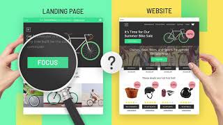
SourceA landing page is a standalone web page with no navigation menu, built entirely around a single action: sign up, download, buy, or book. Unlike a homepage -- which tries to explain everything to everyone -- a landing page is a focused argument addressed to one type of visitor with one specific need.
Think of it like a sales conversation compressed into a page. A good salesperson does not open by listing product specs. They start with the problem, explain the solution, show proof it works, and then ask for the order. A landing page does the same thing, in the same order, every time.
Why It Matters (with data)
Every rupee or dollar spent on paid ads, email campaigns, or SEO sends traffic somewhere. If that destination is a cluttered homepage, most of the budget is wasted.
Key 2026 numbers from SEO Sherpa's landing page benchmarks:
- The global median conversion rate across 18 industries is 9.48%. Top-performing pages hit roughly 3x that.
- 90% of visitors read both the headline and the CTA -- these two elements alone determine whether most visitors stay or leave.
- Pages that load in approximately 2.4 seconds convert roughly twice as well as slower pages. A 0.1-second improvement yields an 8-10% conversion increase.
- 83% of landing page traffic now comes from mobile devices. Pages that are not mobile-optimized are losing the majority of their audience before a single word is read.
- Adding video to a landing page can increase conversions by up to 86%.
- As the number of page elements increases from 400 to 6,000, the probability of conversion drops by 95%. Clutter kills conversions.
Landing pages matter for:
- Paid search and social ad campaigns (Google Ads, Meta, LinkedIn)
- Email marketing offers and limited-time promotions
- Product launches and event registrations
- Lead generation for B2B sales pipelines
How It Works: The 7-Section Playbook
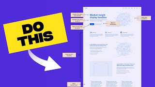
A high-converting landing page follows seven sections in order. Each section earns the visitor's trust enough to keep reading until they reach the CTA.
Section 1: Headline
One sentence. States the outcome or benefit the visitor will get. Not the product name. Not a clever tagline. The direct answer to: "What will I get if I stay on this page?"
- Good: "Close More Deals Without Cold Calling"
- Weak: "Introducing SalesBot 3.0"
Research confirms that 90% of visitors read the headline first. If it does not immediately speak to their situation, they leave.
Section 2: Subheadline
One to two sentences that add context. Answer: who is this for, and how does it work at a high level? The subheadline bridges the gap between the promise in the headline and the explanation that follows.
Section 3: Hero Image or Video
A visual that reinforces the headline. Best options, in order of effectiveness:
- A short explainer video (can lift conversions up to 86%)
- A screenshot or product demo showing the outcome
- A photo of the target customer in a relatable situation
Avoid stock photos of people shaking hands. Visitors recognize and distrust them.
Section 4: Benefits List
Three to five short bullet points focused on outcomes, not features. The test: does each bullet answer "so what?" for the visitor?
- Feature: "Automated scheduling"
- Benefit: "Save 3 hours every week on calendar management"
Section 5: Social Proof
Overtoom's product pages, in the zone directly below the 'Add to Basket' button Visitors were hesitating right before clicking Add to Basket, and the team suspected unresolved doubt at the exact decision point was the cause Added customer star ratings, a free-shipping threshold callout, and multiple payment-method options directly beneath the CTA button
Result: 24% increase in Add to Basket conversions, statistically significant at 99.9% (Roughly 10 days to reach significance).
SourceThis is the section that removes skepticism. Effective social proof includes:
- Direct customer quotes with a name, title, and photo
- Logos of recognizable companies using the product
- A specific stat: "Trusted by 12,000 marketers in 40 countries"
- Star ratings from G2, Capterra, or Trustpilot with the review count
Place social proof near the CTA -- not only at the bottom. Visitors who scroll to the button are closest to converting, and a testimonial right before the click removes the last hesitation.
Section 6: Call to Action (CTA)
One button. One label. Make the label describe what happens next.
- Strong: "Start My Free Trial", "Get the Free Guide", "Book a 15-Minute Demo"
- Weak: "Submit", "Click Here", "Continue"
Personalized CTAs convert 202% higher than generic ones. If you know the visitor came from a specific ad or email segment, match the CTA language to that context.
Section 7: Objection Handler
A short line of text immediately below or beside the CTA button. Its job is to remove the last micro-doubt that stops a hand from clicking.
- "No credit card required."
- "Cancel anytime. No questions asked."
- "Setup takes under 2 minutes."
This is the smallest section on the page. It is also one of the highest-leverage improvements any landing page can make.
Real Company Examples
Basecamp (2022): 40% More Free Trial Signups
Basecamp redesigned their landing page by removing secondary navigation, cutting their copy by half, and placing a single customer testimonial directly above the CTA button. The page went from a multi-column, feature-heavy layout to a single-column page following all seven sections in order. Free trial signups increased by 40%. The lesson: the improvement was not better copy -- it was a better structure.
What Basecamp changed: They removed every link that was not the CTA, shortened every section to its minimum effective length, and added friction-reducing microcopy ("No credit card required. Cancel anytime.") directly under the signup button. The page now loads in under 2 seconds on mobile. The 40% conversion lift came entirely from structural changes.
HubSpot: 55% Conversion Lift from Dedicated Pages
HubSpot's internal research found that companies with 10 to 15 dedicated landing pages see 55% more conversions than those using a single homepage for all traffic. Companies with over 40 landing pages -- each matched to a specific audience and offer -- saw 500% more conversions than companies with fewer than 5 pages. Each page followed the same seven-section structure, with the headline and CTA language matched to the specific ad or email that sent the traffic.
The key insight from HubSpot: Message match matters. When the headline of the landing page mirrors the language of the ad or email that brought the visitor there, visitors immediately feel they are in the right place. When there is a mismatch -- the ad says "Free Analytics Tool" but the page says "Welcome to DataPro" -- visitors assume they clicked the wrong link and leave. Every dedicated page should feel like a direct continuation of the ad that preceded it.
Common Mistakes
Mistake 1: Starting with the company, not the visitor. Most first-draft landing pages open with "We are [Company Name] and we built..." This forces the visitor to figure out why they should care. Start with the visitor's problem or desired outcome instead.
Mistake 2: Multiple offers on one page. Data shows pages with multiple offers convert 266% worse than pages with a single offer. Offering a free trial, a demo, a newsletter signup, and a downloadable guide on the same page splits attention and drives action on none of them.
Mistake 3: Forms with too many fields. The industry average is 11 form fields. Pages with 4 fields convert 120% better. Ask only for what you need to take the next step. You can collect more information after the visitor has said yes once.
Mistake 4: No social proof near the CTA. Most landing pages bury testimonials at the bottom. Visitors who scroll to the CTA button are the most likely to convert -- place at least one piece of social proof directly above or beside the button.
Mistake 5: Slow load times on mobile. 83% of landing page traffic is mobile. A page that takes more than 3 seconds to load loses 53% of visitors before they see a single word. Page speed is not a technical detail -- it is a conversion rate variable.
Key Takeaways
- A landing page is a single-goal page with no navigation, no distractions, and one CTA.
- Seven sections in order move visitors from curious to convinced: headline, subheadline, hero, benefits, social proof, CTA, objection handler.
- 90% of visitors read the headline and CTA -- these two elements drive most of the conversion result.
- Personalized CTAs outperform generic ones by 202%. Match CTA language to the ad or email that brought the visitor.
- Keep forms to 4 fields. Every additional field reduces conversions.
- Mobile load speed under 2.4 seconds roughly doubles conversion rates compared to slower pages.