The Hero Section Formula
In 2025, you have roughly three seconds to convince a visitor your site is worth their time. Everything above the fold either earns the scroll or loses the visitor forever.
Quick Summary
- The hero section is everything visible before a user scrolls: it is your single highest-leverage conversion asset.
- A study of 100 startup hero sections (Ofspace, 2024) found 74% failed due to avoidable mistakes like multiple CTAs and vague headlines.
- 37% of visitors leave immediately when they cannot understand the offering within three seconds.
- Optimizing the hero section produces an average conversion lift of 38%, higher than any other single page element tested.
- The formula is four components in a fixed order: outcome headline, supporting subheadline, one CTA button, and a contextual visual.
What It Actually Is
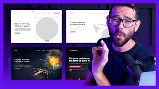
The hero section is the visible portion of a webpage before a visitor scrolls. Its only job is to answer one question in under three seconds: "What is this and why should I care?"
Think of it like a billboard on a fast motorway. A driver passes at 100 km/h and has about two seconds to register your message. If the billboard says "Welcome to Acme Co, Innovating Since 1998," the driver learns nothing. If it says "Cut Your Tax Bill by 30%," the driver knows exactly what you offer and whether it is relevant to them. Your hero section works the same way: clarity at speed beats cleverness every time.
Why It Matters (with data)
Traffic is expensive. Whether you are paying for ads or grinding out SEO, every visitor who bounces from a weak hero section is wasted acquisition spend.
Here is what the research shows about the stakes:
- 37% of visitors leave if they cannot understand what a site offers within three seconds, according to WP Rocket research cited by Ofspace.
- 74% of startup hero sections fail due to repeated, avoidable mistakes, based on Ofspace's 2024 analysis of 100 live startup sites.
- Optimizing the hero section delivers an average 38% conversion lift, higher than any other single element across a dataset of 500+ A/B tests.
- Hubstaff, a workforce management SaaS, redesigned their homepage hero with stronger messaging, clearer layout, and updated social proof. The hero form submission conversion rate rose 34% with no changes to the rest of the page.
- Removing competing navigation links from the hero area has produced a 336% increase in conversion performance in documented landing page tests, per CROPink's CRO statistics roundup.
- Companies using systematic CRO tools and testing see an average ROI of 223%, according to SingleGrain's 2025 CRO statistics.
The math is straightforward: if your hero converts at 4% instead of 2%, you double every lead from the same traffic budget. No new ads, no new content, no new targeting.
How It Works: The Four-Component Stack
The hero section formula has four components. They stack in a specific order because each one builds on the previous.
1. The Outcome Headline
One sentence. Names the result the visitor will get, not who you are. No company name. No tagline. No clever wordplay.
Weak: "Welcome to GrowthOS, The Future of Business Software" Strong: "Get Your First 100 Paying Customers in 90 Days"
The headline must pass what copywriters call the "stranger test": if a stranger read it without any other context, would they immediately know what they would get?
2. The Supporting Subheadline
One to two sentences. Answers: who is this for, and how does the outcome get delivered?
The subheadline adds specificity without adding complexity. It is where you name your mechanism or your audience segment. Example: "GrowthOS gives early-stage SaaS founders a proven outreach system, CRM, and weekly coaching calls."
3. The Single CTA Button
Kommunicate's homepage, next to the 'Try for Free' CTA button The team suspected an email-address input field sitting beside the CTA was splitting visitor attention and adding friction before the click Removed the email field entirely, leaving only the single 'Try for Free' CTA button in that zone
Result: 25.53% increase in clicks on the CTA button (A 2-week A/B test).
SourceOne button. One action. Label it with the outcome, not a generic verb.
- "Get My Free Audit" beats "Submit"
- "Start Growing Today" beats "Sign Up"
- "See How It Works" beats "Learn More"
The Ofspace 2024 analysis found that 27% of startup hero sections had multiple equally-weighted CTA buttons. Those sites were nearly three times more likely to also lack trust signals, creating a compounded credibility problem. Pick one action and commit to it.
4. The Contextual Visual
The 2008 presidential campaign's email signup splash page Campaign staff assumed a video would outperform static images, but wanted to test every combination rather than guess Ran a full-factorial test of 4 CTA button variants against 6 media options (3 images and 3 videos) to find the highest-converting hero combination
Result: Winning combination lifted signup rate from 8.26% to 11.6%, a 40.6% improvement -- contrary to the team's own prediction, all images beat all videos, contributing to roughly $60 million in additional donations (Tested starting December 2007).
SourceAn image, product screenshot, short video, or illustration that shows the outcome or the product in use. This component is optional but powerful. Adding video to a landing page improves conversions by an average of 86%, per documented testing data.
The visual must reinforce the headline, not contradict it. A photo of smiling stock-photo people next to a headline about accounting software creates cognitive dissonance. Show the product, the result, or the customer's situation being solved.
Real Company Examples
Hubstaff (2024): 34% More Hero Form Submissions
Hubstaff, a workforce management software company, ran a full hero redesign test in 2024. The original homepage had generic navigation-heavy design, soft messaging, and a buried CTA. The new version featured revamped hero messaging that named outcomes for their core buyer (remote team managers), stronger social proof logos placed directly in the hero area, and a single form submission CTA prominently positioned. Result: hero form submission conversion rate increased by 34% with no changes to pricing, product, or traffic sources.
Hubstaff's 2024 test proved that the hero is worth testing before anything else. A 34% lift in form submissions came entirely from clearer messaging and removing clutter from the visible zone. The same traffic, a different first impression, and a dramatically different outcome.
Ofspace Analysis of 100 Startups (2024): The Cost of Getting It Wrong
Ofspace conducted a structured analysis of 100 startup hero sections in 2024 and found the following failure breakdown:
- 27% had multiple primary CTAs, creating decision paralysis
- 20% had an unclear or absent value proposition
- 20% had no trust signals above the fold
- 20% used weak or irrelevant imagery
- 25% had serious mobile usability failures, including CTAs pushed below the fold on mobile screens
The startups with multiple equally-weighted CTAs were also 50% less likely to include social proof in the hero, compounding their conversion problems. The analysis confirmed what A/B testing data consistently shows: the hero section is where most conversion is won or lost, and most sites are losing it.
Ofspace's 2024 finding: sites that put two or more equally styled CTAs in the hero were nearly 3x more likely to also lack trust signals. These two mistakes amplify each other. A confused visitor who also sees no credibility markers will always choose to leave.
Common Mistakes
Mistake 1: Writing the Headline About Your Company
"Welcome to [Company Name]" or "[Company Name], Innovating Since [Year]" teaches the visitor nothing about what they will get. The headline must name the visitor's outcome, not your identity.
Mistake 2: Multiple CTA Buttons
Every additional CTA in the hero reduces the likelihood that the visitor clicks any of them. This is not a theory: 27% of startups in the 2024 Ofspace analysis made this mistake, and those sites showed compounded conversion failures. One button. One action.
Mistake 3: Vague Subheadlines Full of Jargon
"Our AI-powered synergistic platform enables scalable growth solutions" means nothing to anyone. The subheadline should name a specific audience and a specific mechanism. Replace jargon with nouns and verbs a ten-year-old could understand.
Mistake 4: Ignoring Mobile
25% of startup hero sections had major mobile usability problems in 2024 analysis, with CTAs pushed below the fold on small screens. Your hero must work on mobile first. If the CTA is not visible without scrolling on a phone, you have no hero section for the majority of your visitors.
Mistake 5: Using Stock Photography That Does Not Match the Headline
A headline promising efficiency to accountants next to a photo of people jumping on a beach creates confusion. Visitors process images before they read text. The visual must confirm the headline's promise, not distract from it.
Mistake 6: No Trust Signals Above the Fold
20% of startup hero sections had zero credibility markers visible before the visitor scrolled. Client logos, review counts, testimonial snippets, or a single data point ("Used by 12,000+ marketers") placed near the CTA reduce the friction between interest and action. When trust signals are absent, doubt fills the gap.
Key Takeaways
- You have three seconds. If your headline does not name an outcome the visitor wants, they leave.
- One CTA button outperforms two every time. Multiple buttons create paralysis, not choice.
- 74% of startup hero sections fail due to mistakes that are fixable in an afternoon.
- Optimizing your hero before anything else produces the highest conversion lift per hour of work: average 38% from documented A/B testing.
- Your subheadline should name who this is for and how the outcome is delivered. No jargon.
- Test mobile. If your CTA is below the fold on a phone, your hero does not exist for mobile visitors.