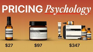
Pricing Psychology
Two SaaS companies sell the same feature set. One converts at twice the rate. The product is identical, but the pricing page is not. This lesson is for founders, growth marketers, and product managers who own a pricing page and want to move the needle without rebuilding anything.
Quick Summary
- Anchoring (showing a high price first) makes your target price feel like a bargain.
- The decoy effect uses a "bad deal" option to push buyers toward the plan you actually want them to pick.
- Charm pricing (prices ending in 9 or 99) lifts sales by up to 60% in retail categories.
- Three tiers is the proven sweet spot, more options trigger choice paralysis and kill conversions.
- Visual cues like "Most Popular" badges raise selection of the highlighted plan by about 31-60%.
What Is Pricing Psychology?
Pricing psychology is the practice of structuring numbers, tiers, and visual layout so buyers reach the decision you want them to reach. The product cost stays the same, the framing changes.
A simple example: a coffee shop lists drip coffee at $3, pour-over at $6.50, and a "barista flight" at $7. Almost nobody buys the flight. It exists to make $6.50 look reasonable. That is the decoy effect doing the work of a salesperson.
Pricing psychology is not about tricks. It is about matching the way human brains naturally process comparisons. Buyers do not evaluate prices in isolation, they compare. Every price on your page sets a reference point for every other price.
Why It Matters: The Data
The research on pricing framing is unusually strong, and the lift is large enough that ignoring it costs real revenue.
Charm pricing (prices ending in 9, 99, or 95):
- A 2003 experiment by MIT and the University of Chicago found charm pricing increased consumer demand by 35%.
- A 2021 university joint study found psychological pricing boosted retail sales by up to 60%.
- About 60.7% of all retail prices today end in 9. That number is not an accident.
Anchoring and tiers:
- Price anchoring raises perceived value by up to 32%, per pricing research aggregated by Capital One Shopping (2025).
- 98% of SaaS companies use multi-tier pricing. Three tiers is the dominant pattern because it creates a clear comparison without overwhelming the buyer.
- HubSpot's 2024 pricing page analysis found pages that lead with outcomes convert 34% better than pages that lead with features.
Decoy effect:
- In Dan Ariely's famous Economist subscription experiment, adding a print-only decoy at the same price as the print-plus-web bundle shifted 84% of buyers to the higher bundle, up from 32% without the decoy. That is a 163% relative lift from one added option.
Promotions:
- 73% more spending happens on "bonus pack" offers versus equivalent discounts (Capital One Shopping, 2025).
- 80% of consumers say a temporary price reduction is enough to make them try a new brand they have never used before.
The Five Core Levers
Lever 1, Anchor High, Then Descend
MVMT's direct-to-consumer pricing page, watches priced $100-$250 Traditional watch retail runs on markups the industry itself doesn't advertise, so any DTC watch feels expensive or cheap only relative to that hidden anchor. MVMT skipped the traditional retail markup entirely and sold direct at $100-$250, positioning against the industry's high-markup norm as the implicit anchor rather than competing on features alone.
Result: Revenue grew from $60M (2016) to $71M (2017), and Movado Group acquired MVMT for roughly $100M upfront (up to $200M total with earnouts) in 2018. (2016-2018).
SourceThe first number a visitor sees becomes the reference point for everything that follows. This is called the anchoring effect (when an initial number influences all judgments that come after it).
List your Enterprise or top tier first, left to right on desktop, top to bottom on mobile, so your target plan feels like the reasonable middle option.
- A $499/month anchor makes $79/month feel like a steal.
- A $79/month anchor makes $79/month feel like the full price.
Same number, completely different perception.
Ahrefs used this in practice: by displaying their highest-priced "Agency" plan first, they increased selection of the "Advanced" plan by 23%. The anchor pulled buyers toward the premium tier, not away from it.
Lever 2, Plant a Decoy
Casper's mattress lineup, expanded from one model to a structured tier set (Original, Nova Hybrid, Wave Hybrid) Casper launched with a single mattress and one price, then added hybrid tiers above it once buyers needed a comparison point, not just a single yes/no purchase decision. Casper introduced the Wave Hybrid as a premium tier above the Original, giving buyers a structured comparison instead of one take-it-or-leave-it price.
Result: Net revenue grew 17.7%, from $373M in 2018 to $439M in 2019, as the expanded tiered lineup rolled out. (2018-2019).
SourceA decoy tier is one that is deliberately worse value than your target tier on one key dimension. Its job is not to sell, its job is to make your target tier look obviously better by comparison.
The classic move: make the middle plan only slightly cheaper than the top plan, but missing the one feature buyers actually care about. Buyers compare, see the middle plan wins on value, and pick the middle plan.
Monday.com used the decoy effect with their "Standard" plan positioned below "Pro," and achieved a 35% upgrade rate from entry-level plans to the higher tier.
Lever 3, Charm-Price the Entry, Round the Top
Use $29 or $49 for low-end plans where price sensitivity (how much buyers care about every dollar) is highest. The 9-ending signals that a price has been sharpened to its minimum.
For enterprise tiers, use round numbers ($500, $2,000). Round prices read as premium and signal quality and confidence. A 99-cent ending can actually cheapen a high-ticket offer in a buyer's mind.
Lever 4, Highlight the Target Plan Visually
A border, a "Most Popular" badge, or a different background color on the middle tier raises selection of that plan significantly.
Buffer used a center-focused design with a "Most Popular" tag and increased mid-tier plan selection by 31%. The visual signal does the job a salesperson would otherwise do.
Lever 5, Frame Annual Savings in Dollars, Not Percentages
Show annual savings as a concrete dollar amount ("Save $240/year"), not just a percentage ("Save 20%"). Absolute numbers anchor harder than percentages, especially on smaller base prices.
Webflow took this further by displaying annual pricing by default, with the monthly equivalent shown in smaller text. The result: a 49% increase in annual plan selection and a massive improvement in cash flow, with no price cuts.
ConvertKit shifted its messaging from feature lists to revenue outcomes. Instead of listing what the tool does, they emphasized what subscribers lose by not having it, a loss aversion (the human tendency to feel losses more sharply than equivalent gains) play. The result: ConvertKit grew from $98,000 to $1.2 million in monthly recurring revenue in under two years. That is a 12x revenue jump driven primarily by reframing, not by adding features.
A Second Framework: The Value Ladder
Most pricing pages are organized around features. The best ones are organized around outcomes. Here is the difference:
HubSpot built its entire pricing structure around a value metric: the number of contacts in your database. As your business grew, your bill grew with it. This aligned pricing with the value buyers actually experienced. The result: HubSpot grew from $255 million to $1.3 billion in annual revenue over five years, while maintaining gross revenue retention above 100%.
A 2024 study found that saying "Professional includes unlimited users" converts 23% better than saying "Starter limits you to 5 users." Same information, opposite framing, one highlights a gain, the other highlights a loss.
Common Mistakes
These errors have killed real pricing-page experiments:
- Fake anchors nobody buys. If your $999 Enterprise tier has zero real customers, you have a fake anchor and a confused sales team. The anchor must be sellable, even if rarely sold.
- Stacking two discount frames at once. Running "$29.99, was $39.99" on an already charm-priced plan sends mixed signals. Pick one frame and commit to it.
- Five tiers instead of three. Every extra option increases choice paralysis (the tendency to delay or avoid decisions when options multiply). Buyers default to "I'll think about it," which means never. Three is the tested sweet spot.
- Hiding the price entirely. "Contact sales" on every tier kills self-serve conversion. Make at least one plan transparently priced so visitors can anchor on something concrete.
- Annual-only pricing without context. Showing annual totals without breaking down the monthly equivalent makes prices look bigger than they are, in the wrong direction.
Quick-Win Checklist
Run through this before your next pricing page review:
- Does your highest-priced tier appear first (left or top)?
- Is your target tier visually highlighted with a badge or border?
- Do you have exactly three tiers, or a strong reason for a different number?
- Does your entry tier end in 9?
- Are annual savings shown as a dollar amount, not just a percentage?
- Does each tier name describe an outcome or a customer type, not just a feature count?
- Is there at least one tier with a transparent, self-serve price?
If any answer is "no," that is your next test.
The One-Line Takeaway
The price you charge matters less than the prices you show around it.